
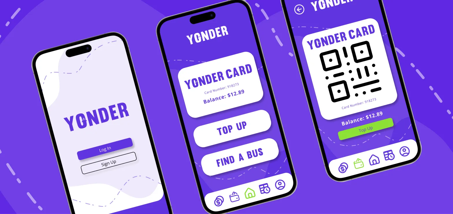
Yonder, a fictional travel card provider, aimed to digitize their existing travel card system to enhance user experience and convenience.
The project focused on creating an intuitive and user-friendly app design that simplified the tagging on and off processes and enabled seamless travel transactions.
Through thorough research and iterative prototyping, I developed a high-fidelity Figma prototype showcasing features such as personalized transaction history and convenient account management options.
Note: This project was part of a short course, and with that time frame only selected pages of the app were required to be prototyped (minimum 3 to 5).
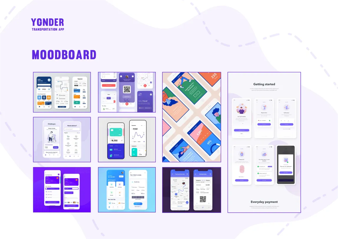
The initial development stages consisted of research to help create a base in which direction to take the overall development of the project.
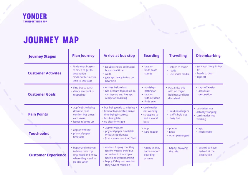
One of the key research methods was interviews.
These interviews were conducted to look into users public transport habits.
The key findings from those interviews were:
Buses are the most common transport used, and at least twice a week.
It’s convenient, you can listen to music and sort life admin, don’t have to concentrate on driving.
No stress over parking and you don't have to pay for petrol.
Good for the environment because for every person, its one less car on the road.
Handy for going to events and you don't want to drive, allows you to have a few drinks.
People are often not prepared to get on (finding their cards etc).
Can be expensive.
It’s easy to lose your card and then also can’t remember how much money is on it, if you top up online it can take a few hours to update.
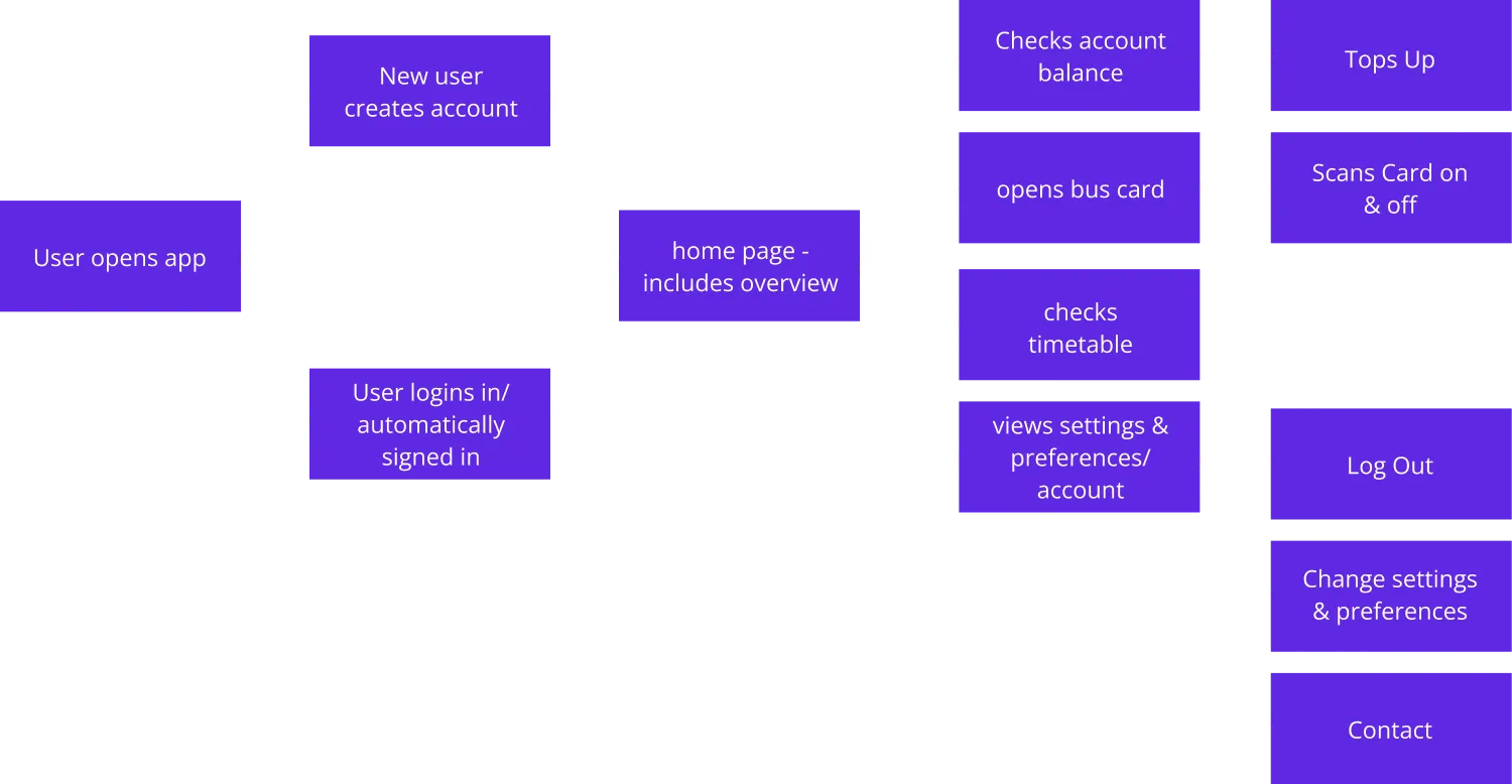
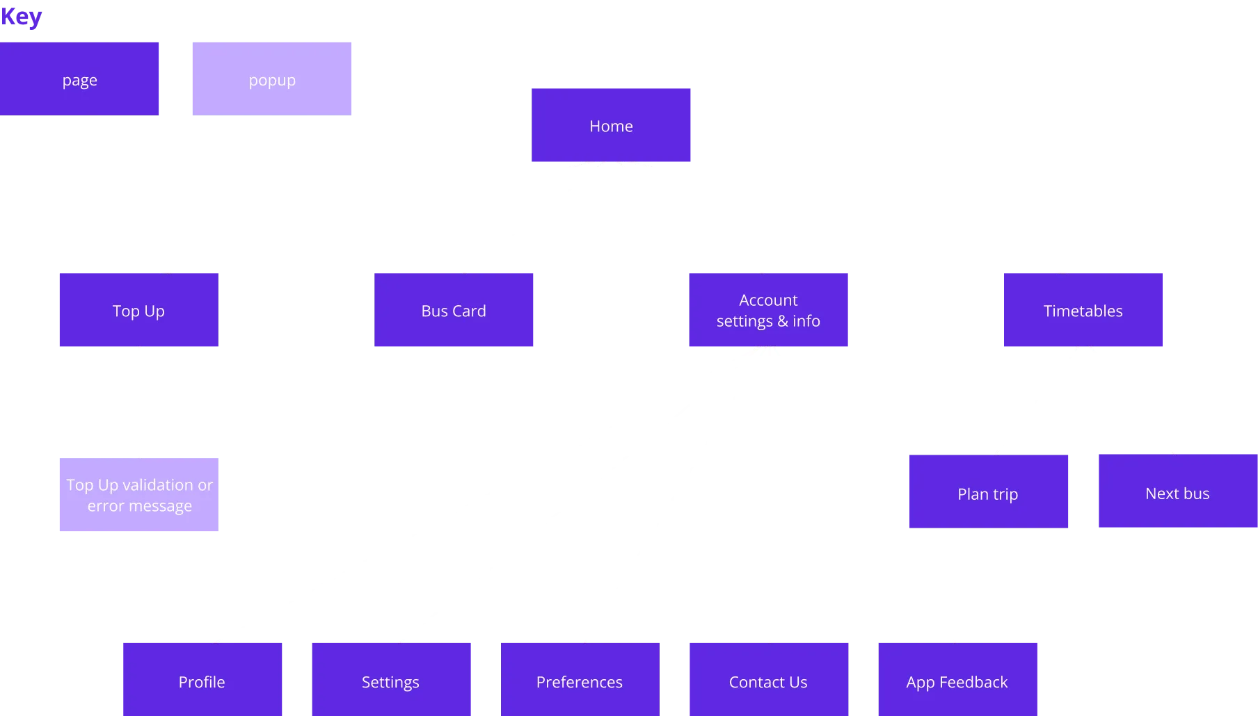
From these findings several personas were created that were then used to establish a Journey Map. This was done to create user flows & a site map.

The app's design predominantly employs Yonder's distinctive purple, which offers a strong contrast against white backgrounds.
This combination serves as a central visual element throughout the interface.For secondary elements like buttons, a complementary shade of green has been introduced. While it maintains high contrast with the brand's purple, its compatibility with white is limited.
Thus, it will be selectively used to ensure optimal visual clarity.
The use of an off black is reserved for specific design elements, notably input text fields and secondary button options, providing effective visual hierarchy against white components.
Due to a tight turnaround, certain aspects took precedence over others in this project. While not every interaction may seamlessly align in a fully realized app concept, a deliberate effort was made to maintain a logical flow.
To achieve this, initial wireframes were thoughtfully crafted, guiding the design process and ensuring a cohesive user experience.
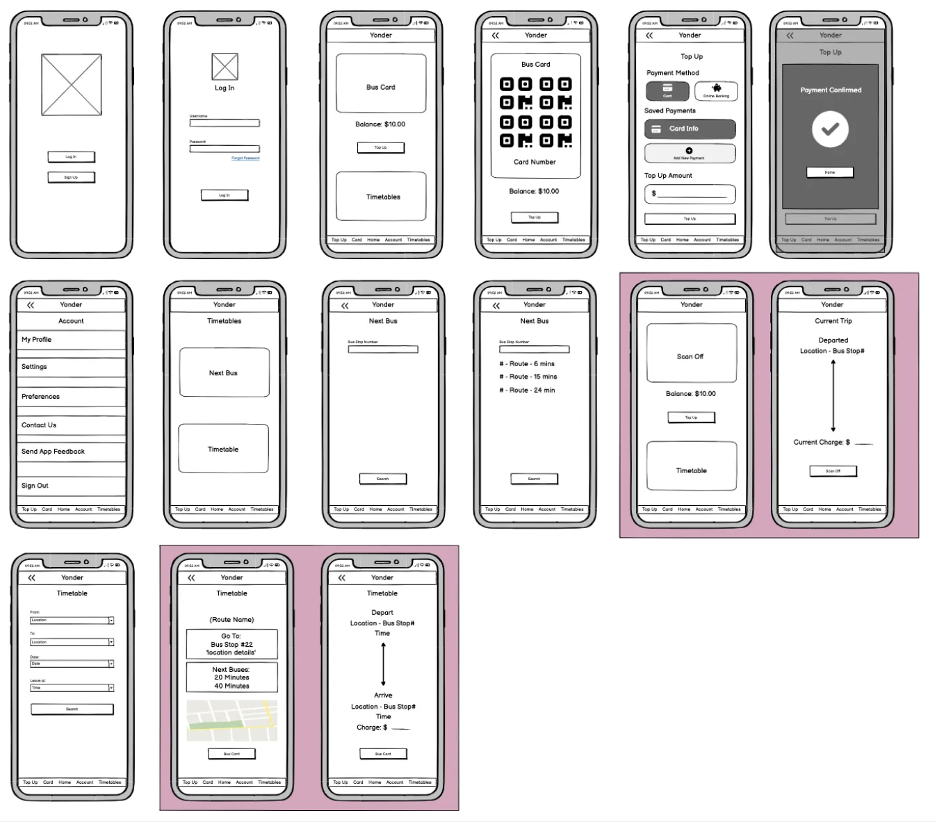
Feedback indicated positive responses to most pages, with users finding the navigation intuitive and the information adequately presented. On select pages, alternative design approaches were explored based on feedback, and a few of these alternatives were subsequently integrated into the final design presentation.

After the completion of the prototype, a round of feedback was gathered to formulate a project summary and assess the prototype's efficacy.
This testing was undertaken with a representative of the app's target demographic, who was assigned various tasks to identify potential bugs and design issues.
The primary insights drawn from the Yonder test are as follows:
The testing confirmed the success of the key aspects I prioritized: a simple design for easy navigation, smooth on/off scanning, and streamlined bus information retrieval. While a few improvement opportunities were identified, many of these relate to non prototyped pages (e.g., scanning off confirmation, top-up), underscoring the potential benefit of these being prototyped for testing.
If you would like to have a look through the full project documentation that was submitted for this course assignment, then feel free to contact me here to receive a copy.