

Packaging for a fictional product set in the Harry Potter Universe was created, specifically for Wiseacre's Wizarding Equipment in Diagon Alley.
The objective was to design packaging for a new model of crystal ball that would appeal to witches and wizards with beginner to intermediate divination skills.
Extensive research was conducted to understand the preferences and needs of the target audience.
To ensure alignment with Wiseacre's Wizarding Equipment's branding and style, a thorough analysis of the store's aesthetic was carried out.
The packaging design reflected the visual language, typography, and color scheme of the Wizarding World while maintaining its unique identity.
The final deliverable included high-fidelity mock-ups showcasing the attractive, functional, and relevant packaging solution.
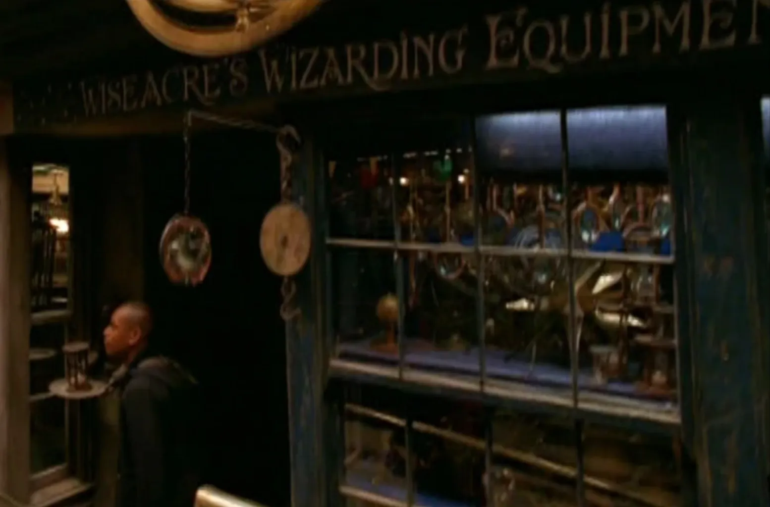
Wiseacre’s Wizarding Equipment is a shop located in North Side, Diagon Alley, that sells a wide variety of magical instruments, including telescopes, hourglasses, and maps.
The term "wiseacre," derived from the word "wise," referred to individuals who claimed to possess extensive knowledge on various subjects, although their actual expertise might have been limited.
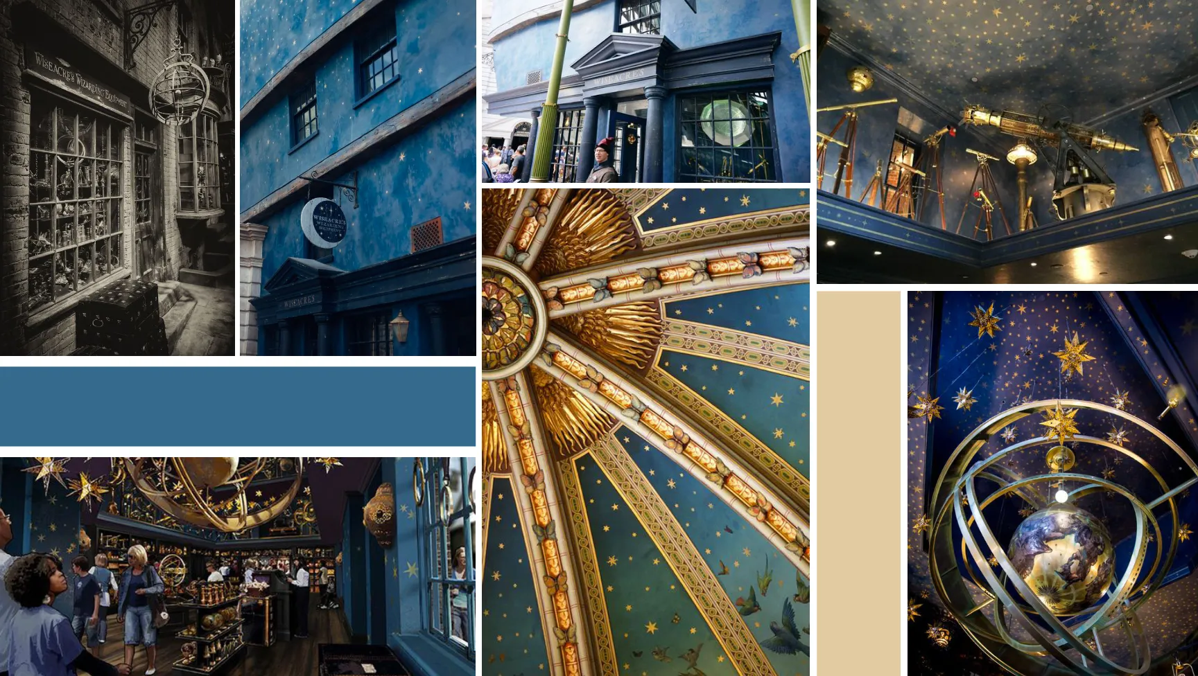
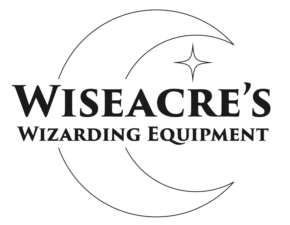
For this logo project, I researched the surroundings of Wiseacre's store in the Harry Potter Universe as no clear branding is noted, however,I drew inspiration from the signage at the Universal Studios theme park as well as it's small feature on a behind the scenes feature from the movies.
Considering the established branding, I created a simple yet legible logo design that centered the moon within the name, maintaining consistency with the font used at Universal.
The colorless nature of the design allows for seamless application on various packaging.

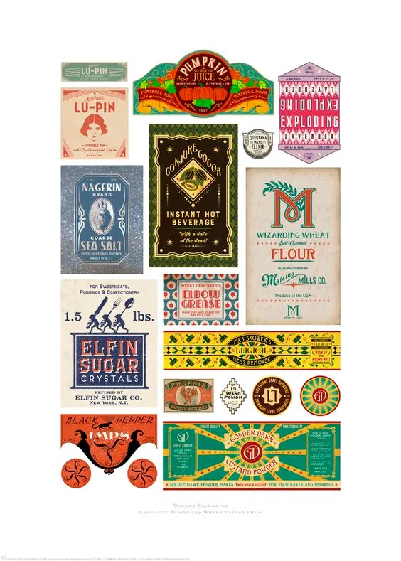
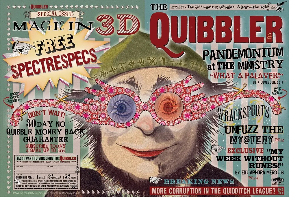
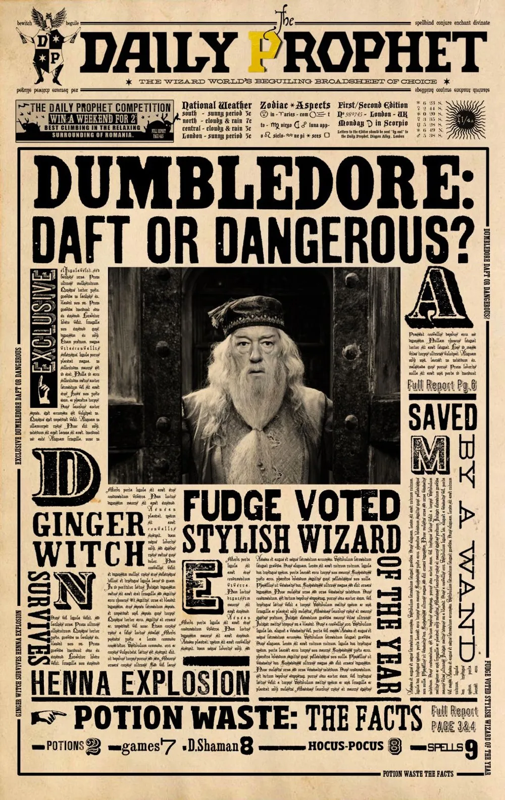
Extensive research into the Harry Potter movie design style was conducted.
MinaLima was the design studio in charge of the designs in the movie so a lot of their process was looked into, as older production methods were mimicked such as letterpress, screen printing & risograph.
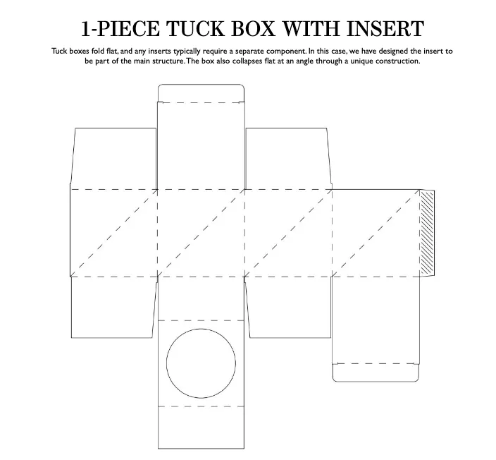
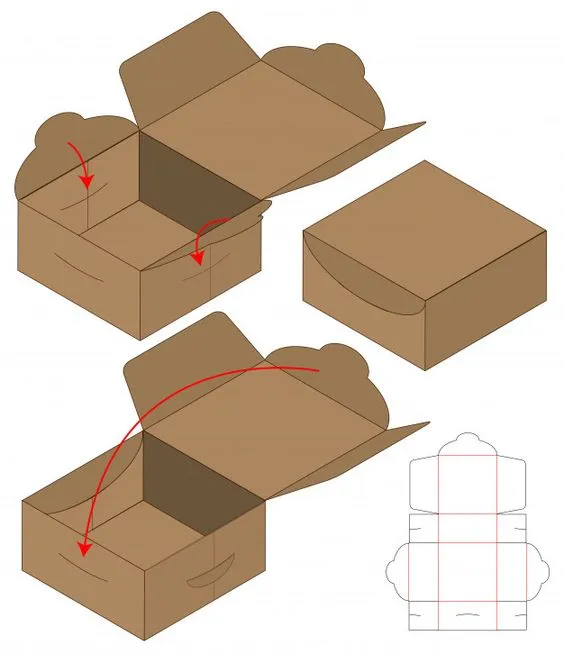
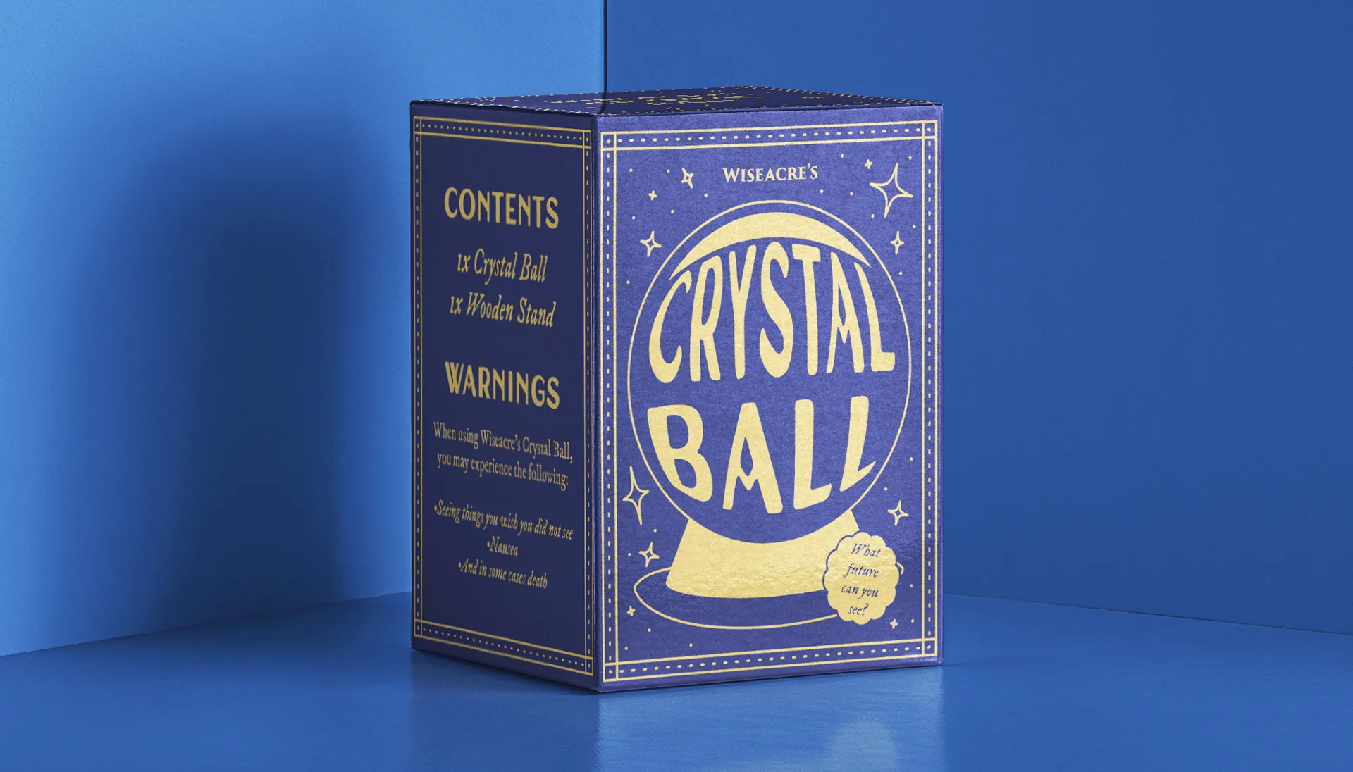
During the project's initial phase, I explored multiple die-line options for the packaging design.
After careful consideration, none of them proved suitable for the project's requirements.
However, through further research, I discovered a more promising alternative that aligned seamlessly with the creative brief and target audience.
Extensive testing confirmed its feasibility, with minimal complexity and a securely sealed closure point.
To enhance aesthetics, I explored variations from other box die-lines, ultimately resizing and customizing one to accommodate the crystal ball and devising a separate insert with a tab for convenient access to the included stand.

Typography played a vital role in the packaging design, requiring thorough exploration of numerous typeface options.
The primary focus was on determining the ideal typeface for the main logo and product name of the crystal ball.
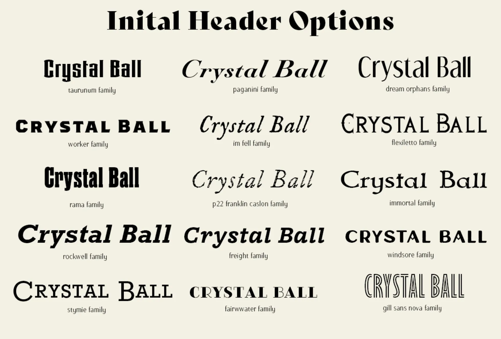
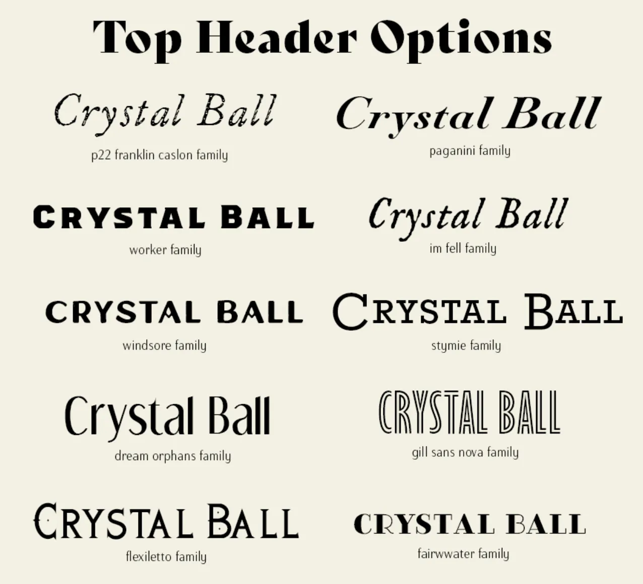
After a careful review of suitable font options, considering the product name and design requirements, a smaller selection was narrowed down.
Some fonts, while promising, posed challenges in terms of fitting within the Harry Potter universe or compromising readability. The choices were further refined to two options that best embodied the intended design style.
These options were then paired with secondary font choices for the packaging's remaining content, aiming to find the optimal combination of typefaces to convey the desired visual aesthetic.
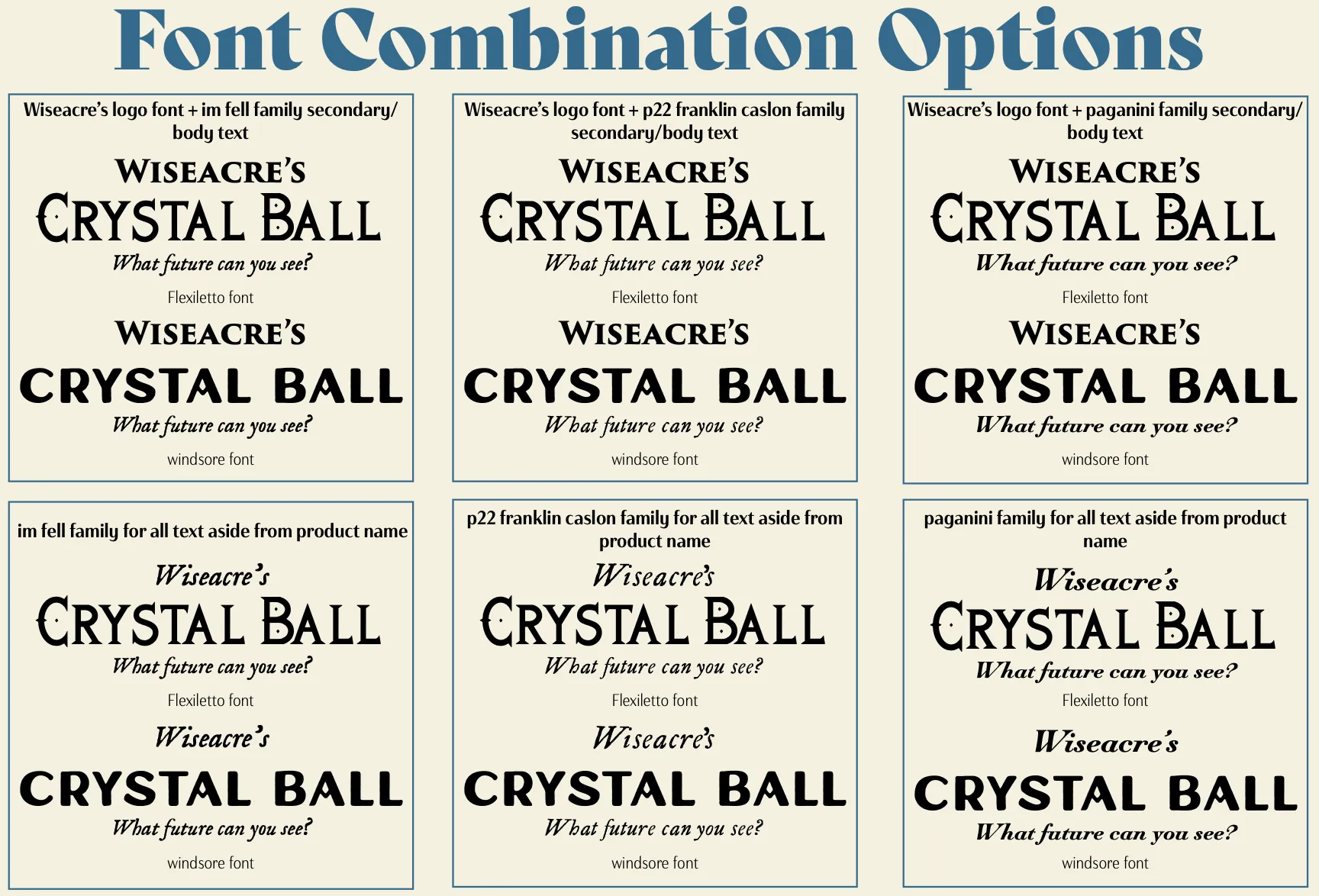

In my final typeface selections, I prioritized maintaining consistency and brand recognition by using the same typeface for the Wiseacre's logo throughout the design.
For the product name, I chose the Windsore typeface as it offered clarity and personality, aligning perfectly with the intended design style.
Initially, I had selected a Paganini typeface as the secondary font but later switched to P22 Franklin Caslon (italic) to introduce more character and avoid excessive similarity with the shop name.
This adjustment added uniqueness while ensuring easy legibility and seamless integration with the design concept.

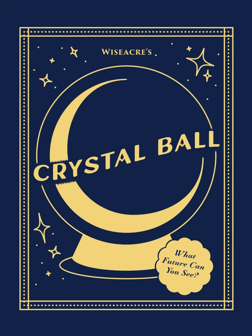
Line art style - inspired by tarot card designs.
This design would only use 2 or 3 colours (lines could also be done in foil).
This was the preferred direction from feedback.

The higher detailed design would include having a patterned background.
More detailed graphical elements, so not strictly line art style.

The words ‘crystal ball’ would take up all the space inside the ball image.
Could include a border around the edge.
Once a preferred design was determined, a comprehensive visual concept was developed based on the selected die-line.
This encompassed the creation of an engaging design that maximized the potential of the chosen structure.
As part of this process, a pattern was introduced for the interior of the box. The pattern, while remaining simple, added an element of intrigue and ensured the overall design remained captivating to the viewer.


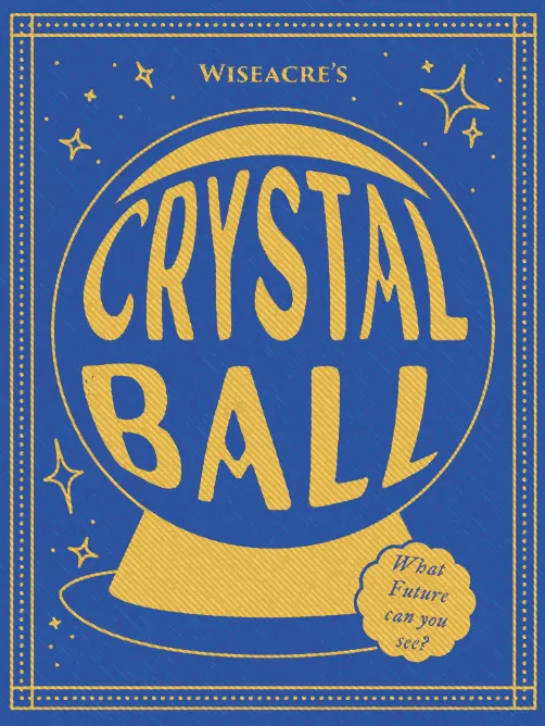
During the initial design stages, I closely followed my concept but made minor adjustments along the way.
I chose to remove the lines around the ball and incorporated more star shapes to compensate.
The placement of the product name within the banner element wasn't achieving the desired effect, as the single-color design sometimes caused the name to get lost against larger elements like the ball's glare.
To address this, I created space around the name to enhance its visibility.
After reflecting on the design, I focused on improving the placement of the product name, which remained a key concern.
To enhance its visibility, I adjusted the size and positioning of the glare, making it smaller and occupying only a small part of the ball.
While the general placement of the name remained unchanged, I felt it still appeared too small in relation to the overall design.
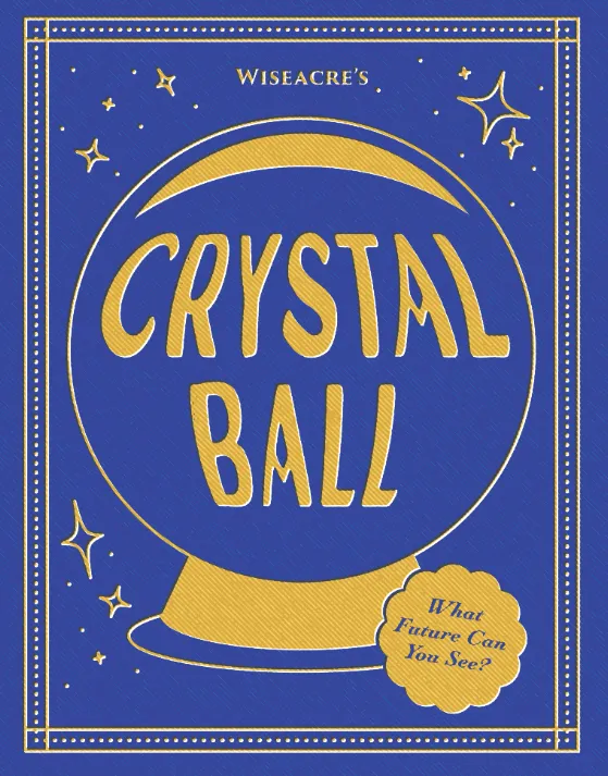
At this stage, I implemented planned effects to achieve a screen-printed appearance, using a half-tone style layer and color burn blend mode for added texture.
I also continued exploring different placements for the name, even considering integrating it into the ball itself based on a previous design concept.
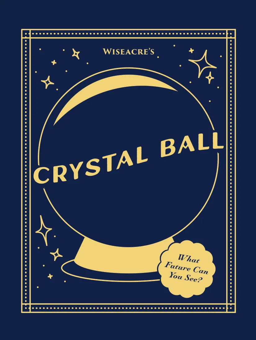
Feedback received on this design was positive, noting the balanced curvature of the text, the harmony between the crystal ball and sparkles, and the overall clean design.
Based on further feedback received, I made additional changes.
I experimented with further distortion of the name, aligning it more closely with the shape of the ball. This adjustment yielded more successful results, giving the ball a sense of dimension.
Another minor modification involved refining the shape of the base, as it didn't appear proportionally accurate.
Furthermore, I adjusted the layout of the product byline, aiming to enhance the overall shape and composition of the design.
If you would like to have a look through the full project documentation that was submitted for this course assignment, then feel free to contact me here to receive a copy.