
As part of a course assignment, I designed and developed a dedicated one page promotional website using HTML, CSS, and JavaScript for Apple TV+'s Ted Lasso.
Inspired by the show's charm, I aimed to create an immersive online platform that offers comprehensive insights into the series.
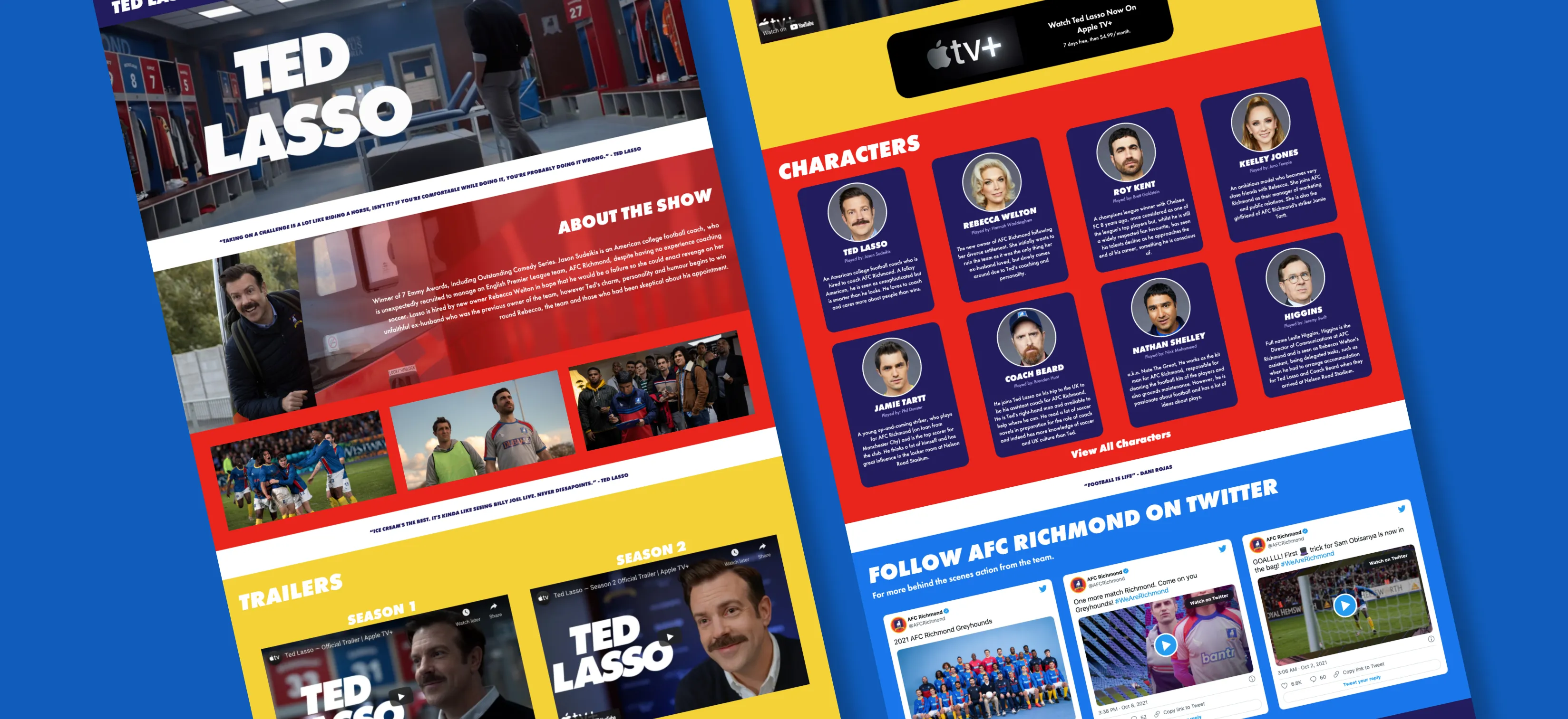
The website serves as a hub of information, featuring in-depth details about the show, its cast and crew, photo galleries, trailers, and user-friendly links for an uninterrupted viewing experience.
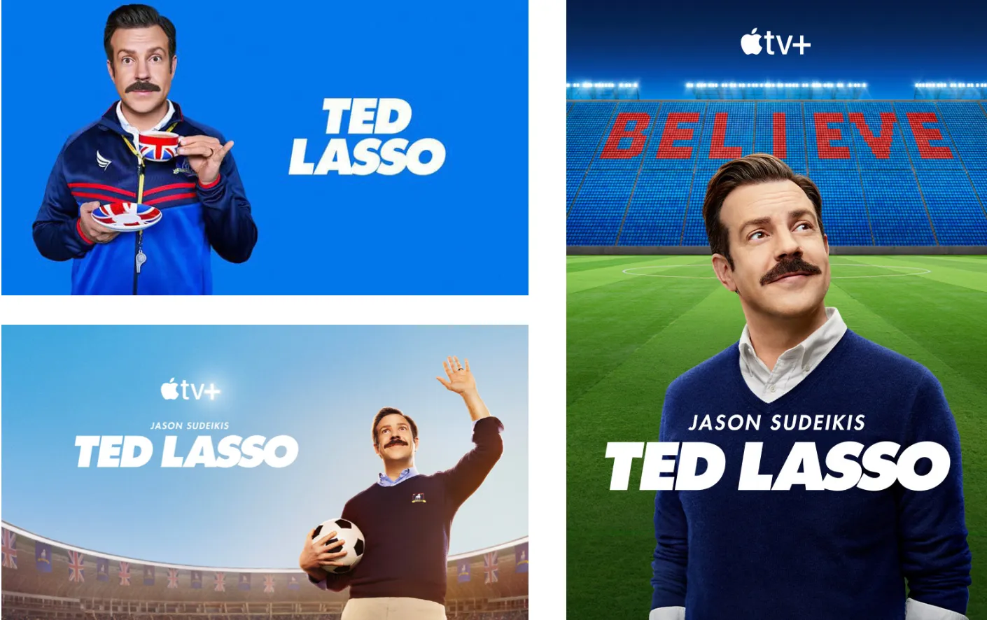
To begin my research, I delved into the promotional posters of the show to determine the appropriate font direction for the website.
As a result, it was established that Futura had been used across the board for the shows logo and information.
TED LASSO

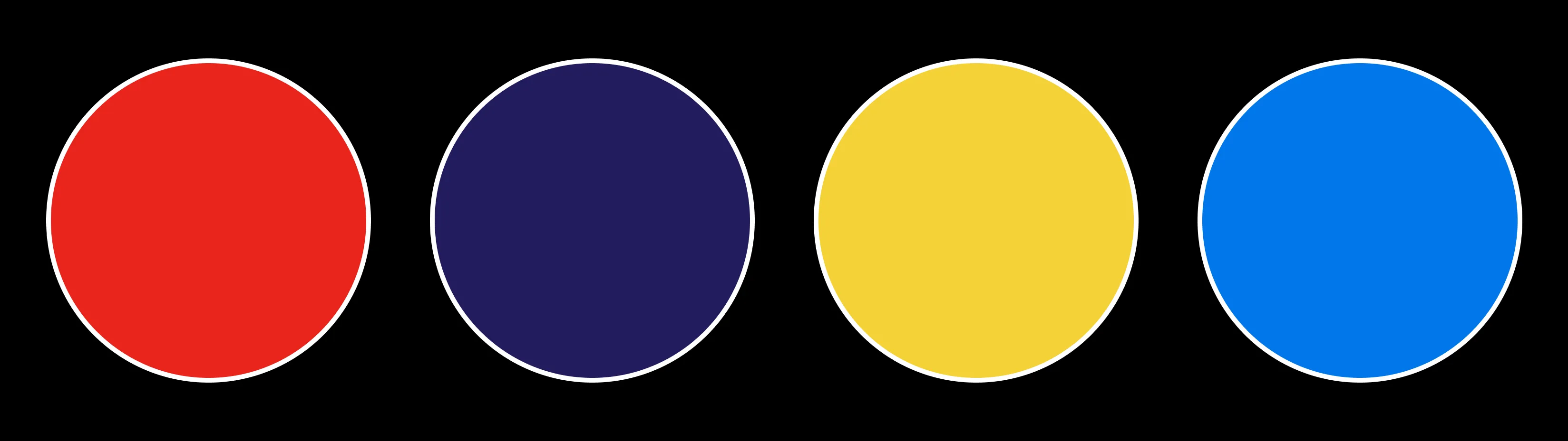
The show features the fictional football team AFC Richmond, which competes in the English Premier League.
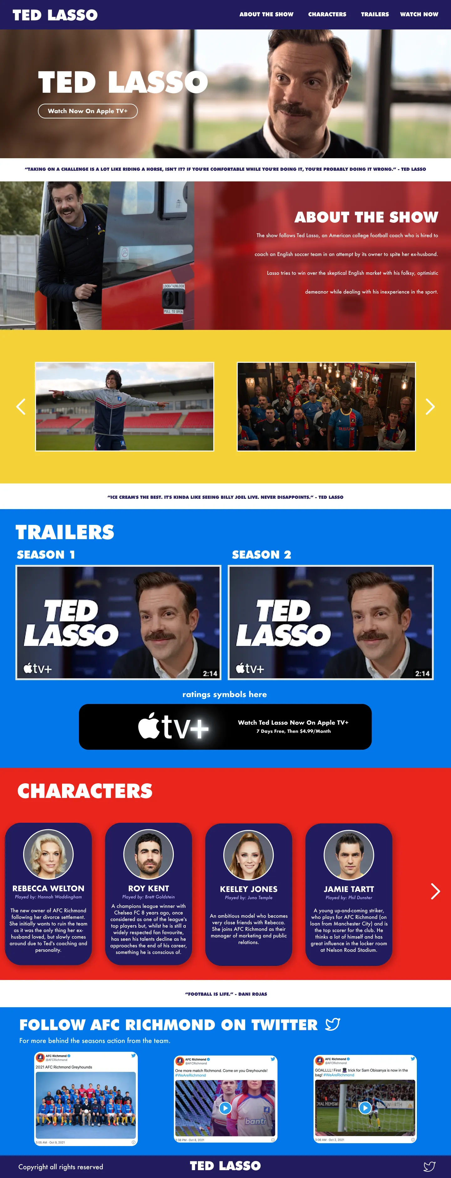
To establish a strong connection between the show and the website, as well as to foster cohesiveness, the team's colours were incorporated throughout the website.
Additionally, a light blue shade reminiscent of the team's kit, visible in the show, was introduced, which also mirrors the blue hue found in the promotional posters researched.
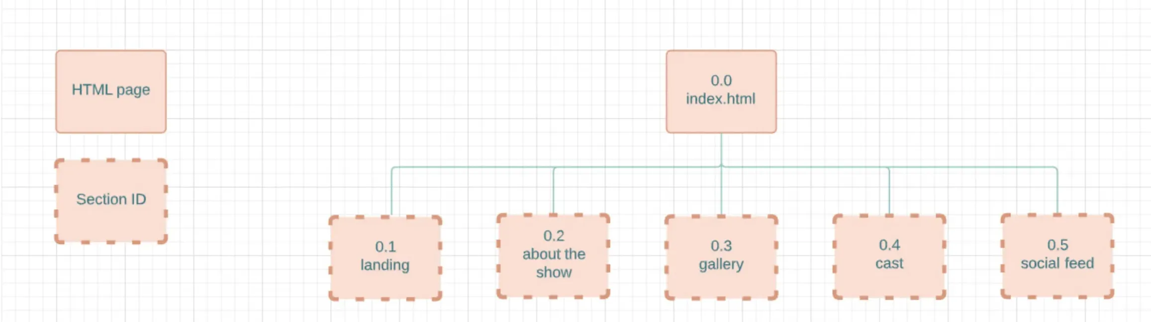
With this website needing to be a single page, the purpose of the sitemap was to establish an appropriate order for presenting the information.
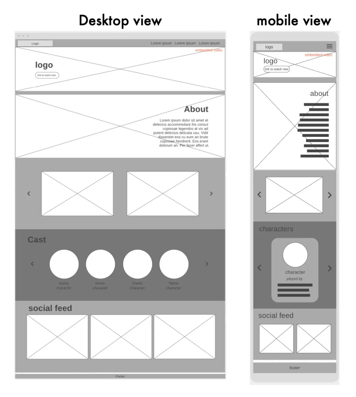
Multiple wireframes were generated, and what you see here is the conclusive low-fidelity rendition, refined through several rounds of feedback and adjustments, before progressing to more intricate mockups.
The initial design aimed to captivate users with an embedded video in the landing section, followed by comprehensive show details. This would seamlessly transition into additional show content, encompassing an image gallery and comprehensive cast information.
To further enrich the platform's authenticity, a dedicated Twitter account was established for the fictional AFC Richmond team, common practice among sports franchises. This account offers both behind-the-scenes insights and show updates, contributing to the immersive experience.
Enhancing this site's team-like ambiance, a social feed section occupies the bottom of the page. This feature enables visitors to access the latest posts, reminiscent of how many sports teams feature such feeds on their websites.
Clear sections of the site were defined using insightful quotes from the show, effectively immersing visitors in its distinctive tone.
At this stage of the design process, links to the trailers were introduced, strategically offering visitors an immersive peek into the show's essence and also emphasizing its binge-worthy appeal, aligning with modern viewing habits.
The inclusion of direct links to the show's trailers and its dedicated Twitter account offered seamless engagement. Alongside, pivotal details about the main cast were thoughtfully presented.
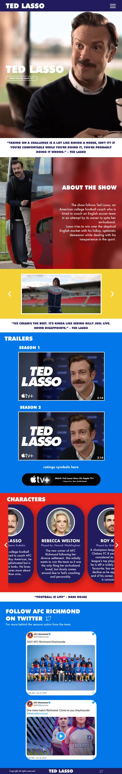
While creating the site, I adjusted the layout due to my JavaScript proficiency level. This resulted in an alternate method of showcasing images and cast information, where multiple images were displayed for show snippets and all cast members were showcased concurrently.
Additionally, I introduced subtle design refinements, including a fade effect behind the show's information. This softened the appearance, deviating from the sharp edge in the initial mockup.

If you would like to have a look through the full project documentation that was submitted for this course assignment, then feel free to contact me here to receive a copy.