
As part of an exploration of design principles, I created a captivating promotional poster for the emerging British singer-songwriter Maisie Peters, capturing the essence of her upcoming music release.
Inspired by her music video promotion and album artwork, I meticulously developed various typographic layouts and visually striking elements to convey the energy and personality of her music.
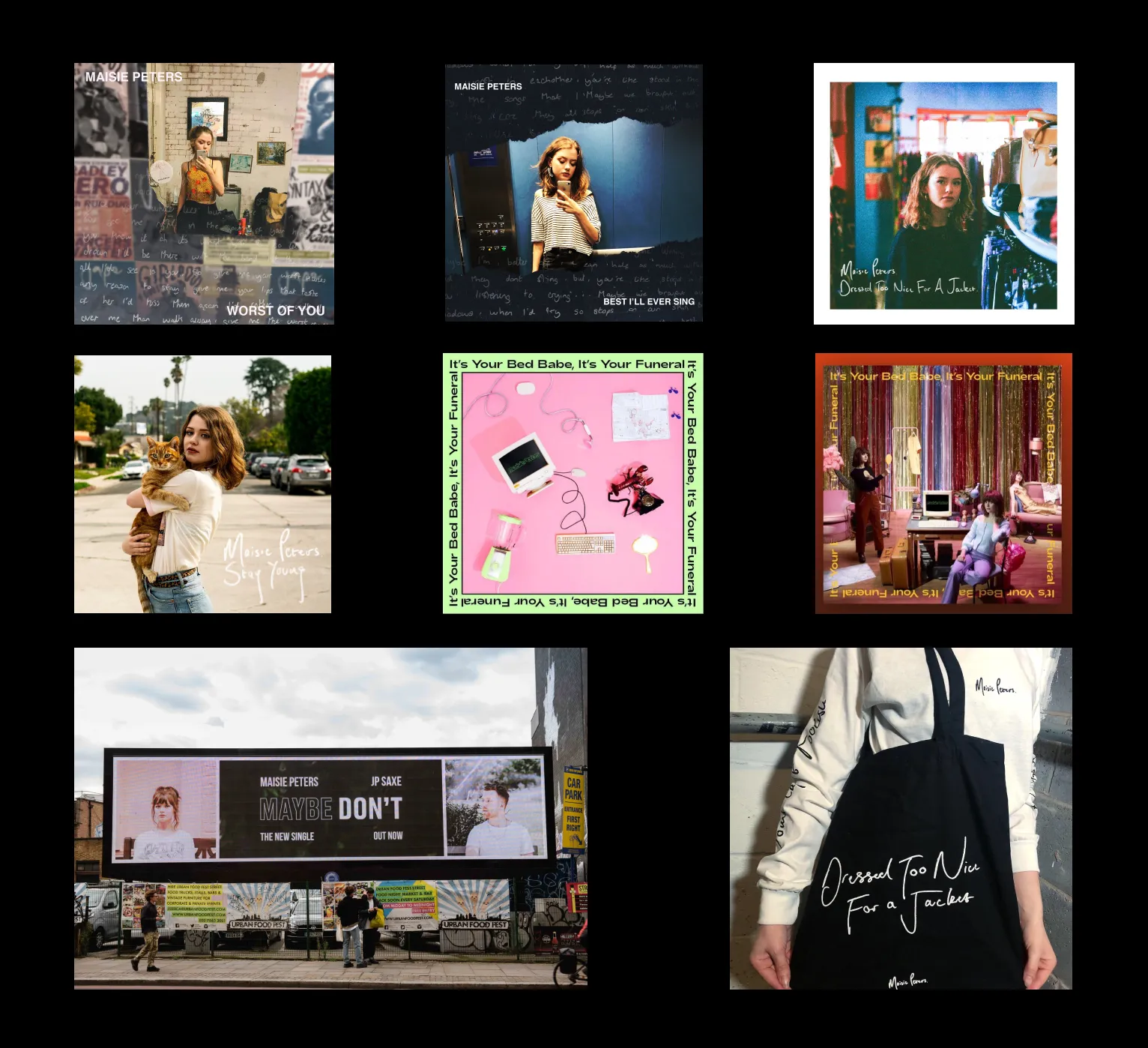
During the initial research phase, I examined Maisie's previous singles and EPs' artwork to identify any recurring elements for familiarity, but found no strong connections.
I then delved into other promotional designs, including merchandise and additional posters, which closely aligned with corresponding album artwork.
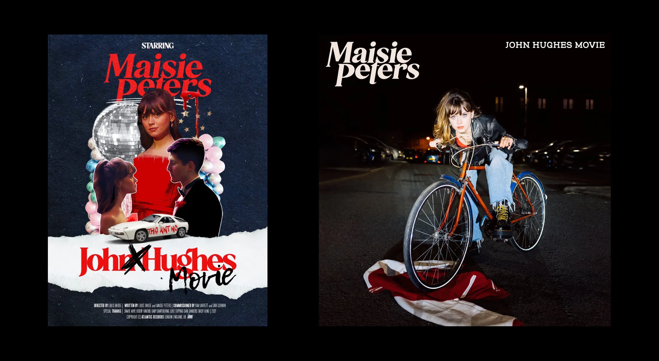
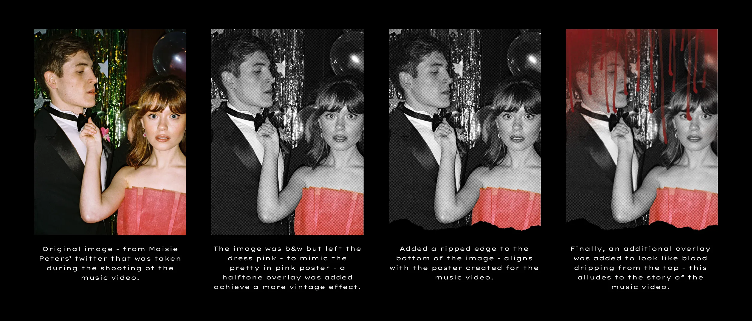
As no clear design links were found, I decided to base my design on the song itself and its accompanying music video, specifically 'John Hughes Movie,' inspired by classic coming-of-age teen comedies.
The design took a new direction, with typography exploration and development.
To maintain consistency, I aimed to align the typography with the style used in the new designs for the song, while also infusing it with my personal touch.
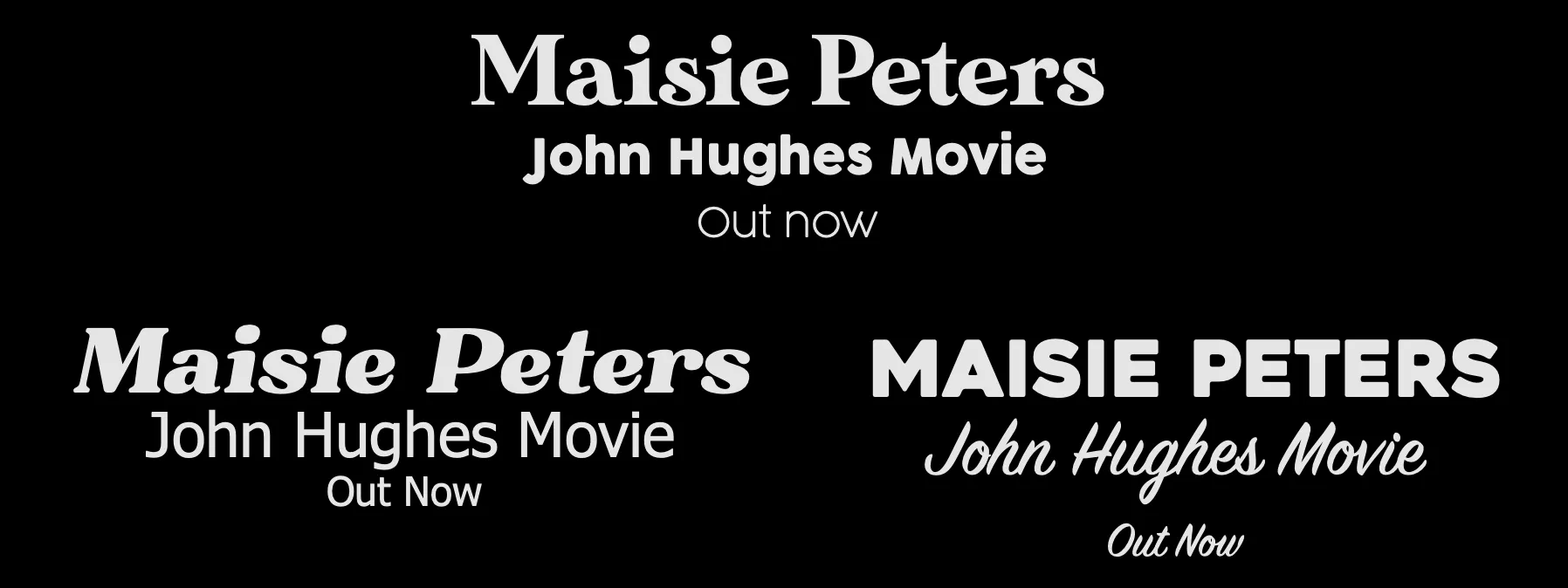
I explored three potential directions that either echoed the new style or drew inspiration from previous designs.
However, before reaching a final decision, I proceeded with creating complete poster design concepts to assess if there might be a more suitable option.
By considering these various directions and developing full design concepts, I sought to ensure that the chosen typography would effectively complement the overall aesthetic of the project while capturing the essence of Maisie's latest song.
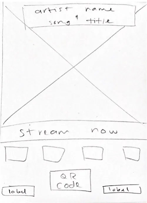
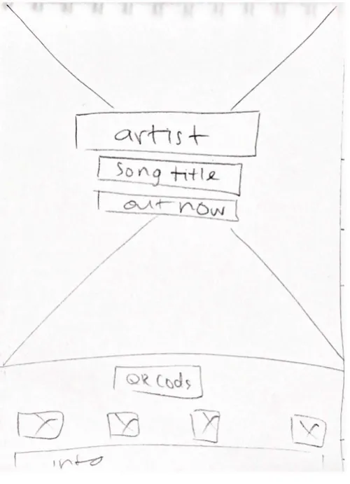
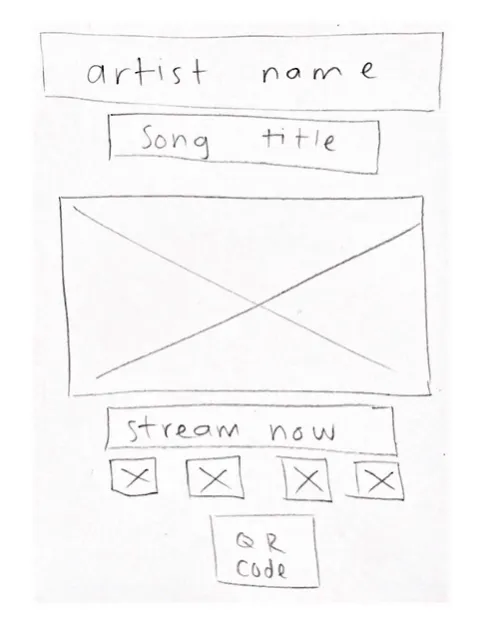
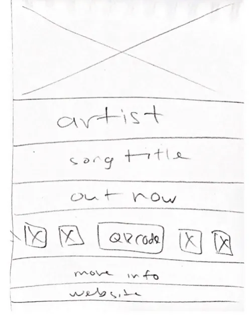
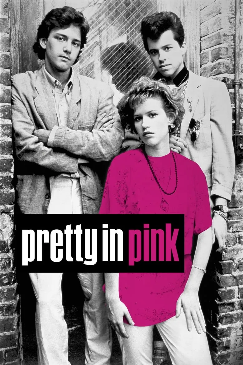
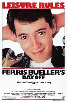
To begin, I sketched draft layouts, adjusting the arrangement and placement of elements. To establish a direction, I created visual imagery for the poster, drawing inspiration from John Hughes' film posters like 'The Breakfast Club' and 'Sixteen Candles.' I noticed that some posters had prominent titles with extensive subtext, effectively conveying essential information. 'Pretty in Pink' stood out, incorporating a black and white theme with a pop of pink. Inspired by these influences, I experimented with layouts to visually connect the poster with the song's thematic elements.
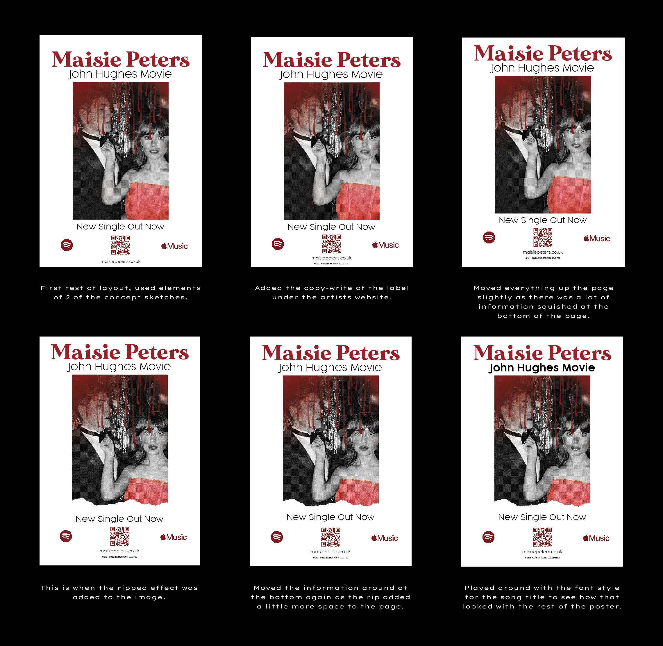
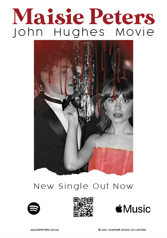
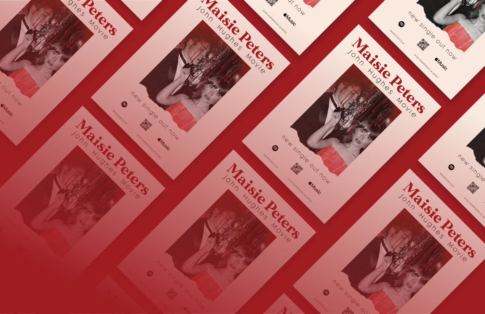
After receiving feedback, I made adjustments to the font style of the song title, added tracking to align it with Maisie's name, and matched the width of the 'new single out now' text with the image.
The Spotify and Apple Music logos were changed to black to align with their brand colors, and the size of logos and the QR code was reduced to reduce distractions. The website and copyright text were unified in font and size, positioned at the bottom.
Modifications were made to the blood drips to avoid overlapping with Maisie's face, ensuring a cohesive and visually appealing composition that effectively conveyed the song's story.